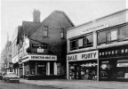
In view of the outraged comments made above, that have just come to light, about my post
#2488, I feel I should offer an explanation.
1. My intention was to show a clear image of the Mothers Nightclub, in which I happen to be interested.
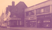
2. The original online newspaper image (to which I gave a full link) was of poor quality:
View attachment 233633
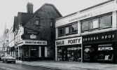
So I thought I would quickly clarify it and used Google "nano2 banana" to do so.
3. I was pleased with the immediate result. I didn't notice that the sign above the Meat supplier was now AI gobbledegook (but then it was incomprehensible in the original). I entirely failed to notice the two pedestrians and a parked bicycle which had been added next to the "Erdington Meat Co", not only because they were unasked for but also because their images are slight and convincingly incorporated into the whole:
View attachment 233635
4. So I was happy to post the image of Mothers Nightclub, highlighting what was required i.e. the actual premises.
5. My main mistake was to have asked the AI engine to "enhance" the original image. That instruction seems to have given it license to adjust things artistically too. I should have been much more specific by requesting something such as "Please sharpen this newspaper image but make no additions". This highlights the fact that AI will do as it is instructed but may add aspects that it's algorithms consider "helpful" unless the instructions are absolutely specific. The result also needs to be carefully checked for accuracy.
6. It is correct to state that if AI is used it should be declared. I thought it had just clarified and sharpened the photographic image in this case like a good graphics program and so nothing else was necessary. As it turned out, however, I was mistaken because subtle additions had been made which I inadvertently overlooked and I apologise for that.
____________________________________________________
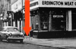
PS Whilst on the subject of additions to images, the statement in
#2493 that the "original less sharp photo" is shown there seems odd because in this version an "XYZ" (see red arrow) appears by the corner of the parked car and is unexplained and absent from the actual, toned (not grayscale) original (which is shown above). Perhaps it was taken from another source.
View attachment 233637